Serif
21
MENTIONS
7
EPISODES
7
PODCASTS
Search complete. 21 mentions across 7 episodes found for "Serif".
Sep 30, 2026

Fiona HumberstoneHOST
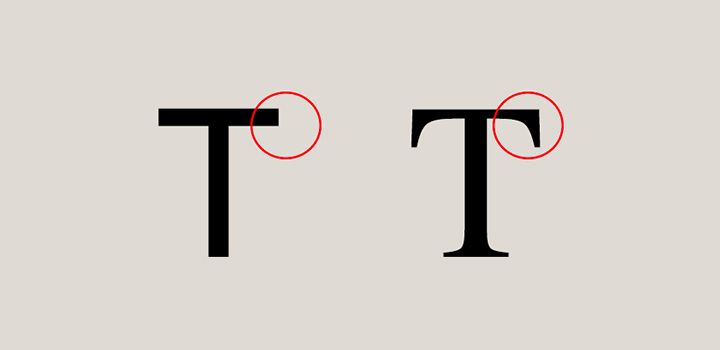
Fonts are split into serif and sans serif.
Fiona HumberstoneHOST
Sans serif is more modern.
Fiona HumberstoneHOST
Serif sort of goes back to the Roman times.
Fiona HumberstoneHOST
So serif is often considered to be too traditional, too stuffy, too formal, whereas a slab serif is a kind of a more modern, no frills version than that.
Fiona HumberstoneHOST
I very often use... chunkier sans serif fonts and capitals which can bring that same level of weight but in a lighter way which suits my aesthetic sensibility better handwriting fonts again you know nothing too precious nothing too pretty nothing too effortful nothing too careful you know you you're often looking for something that feels um Just a bit more irreverent, not precious.

CJ CawleyHOST
Okay, got one.
CJ CawleyHOST
Would you rather only use serif fonts or sans serif fonts for a year, let's say, for one year? Serif, I think.
CJ CawleyHOST
You'd only use serif? Yeah.
JackHOST
Yeah, I'm also really debating bringing a serif into my branding, actually.
JackHOST
And then you can also get this kind of like gloopy, modulary kind of like textured ink, bleedy ones.
JackHOST
And they kind of like, and then everywhere in between, I think that can be covered.
JackHOST
Whereas I think you obviously can get some, San Seraphs that have quite high contrast and they kind of feel like a Seraph.
JackHOST
They just don't have the little legs on them.

Bryan AllenGUEST
It's still humanistic, it's still friendly, but it's very, very graceful and upscale.
Bryan AllenGUEST
Likewise, a font like Trajan, for instance, is a very, very classic Serif font that is based on a font that was carved into Trajan's column in Rome.
Bryan AllenGUEST
It says importance.
Bryan AllenGUEST
And as you've mentioned before, Anthony Goldschmidt was a great designer who realized that tracking it out, letter spacing it out, made it seem even more important.

Izar TarandoshHOST
Yeah, it was
Chris RomeoHOST
always the, what was the Microsoft goofy one? If I wanted Serif, I would have
Matt ColesHOST
taken Serif.
Matt ColesHOST
Exactly.
Matt ColesHOST
What was the

Jesse Tyler FergusonHOST
Mm-hmm.
Maitreyi RamakrishnanGUEST
I love a good Serif.
Jesse Tyler FergusonHOST
Yes.
Maitreyi RamakrishnanGUEST
A good Serif font, you know?
Jesse Tyler FergusonHOST
Serif is very strong.
Maitreyi RamakrishnanGUEST
Love it.
Jesse Tyler FergusonHOST
I love that you even know that it's called Serif.
Maitreyi RamakrishnanGUEST
[laughs]

Pearse O'HalloranHOST
So top of the number one top.
Pearse O'HalloranHOST
Seraph or Sans Seraph? It's a tough choice.
Charlotte Anne GrantGUEST
I'm going
Tegan McDougallGUEST
to say Sans Seraph.
Pearse O'HalloranHOST
I think that, yeah, I think that's like, again, pretty much like sandwich fillings, depends what mood or what context.
Pearse O'HalloranHOST
So some weeks I'm all like, oh, get these service away from me.

MassimoHOST
Yes.
SeanHOST
Sans Serif.
MassimoHOST
Really? Hands down.
MassimoHOST
So I agree with you.
MassimoHOST
I use Sans Serif.
MassimoHOST
I go straight to it.
MassimoHOST
It's our brand font.
MassimoHOST
But I enjoy looking at the Serif fonts because I'm feeling like we've gone so far with the simplicity route and I will still use it, build it.